Coco Cream
Brief and Branding
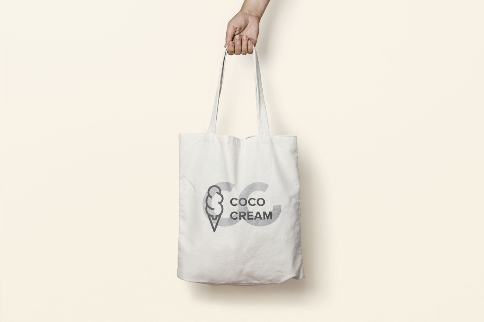
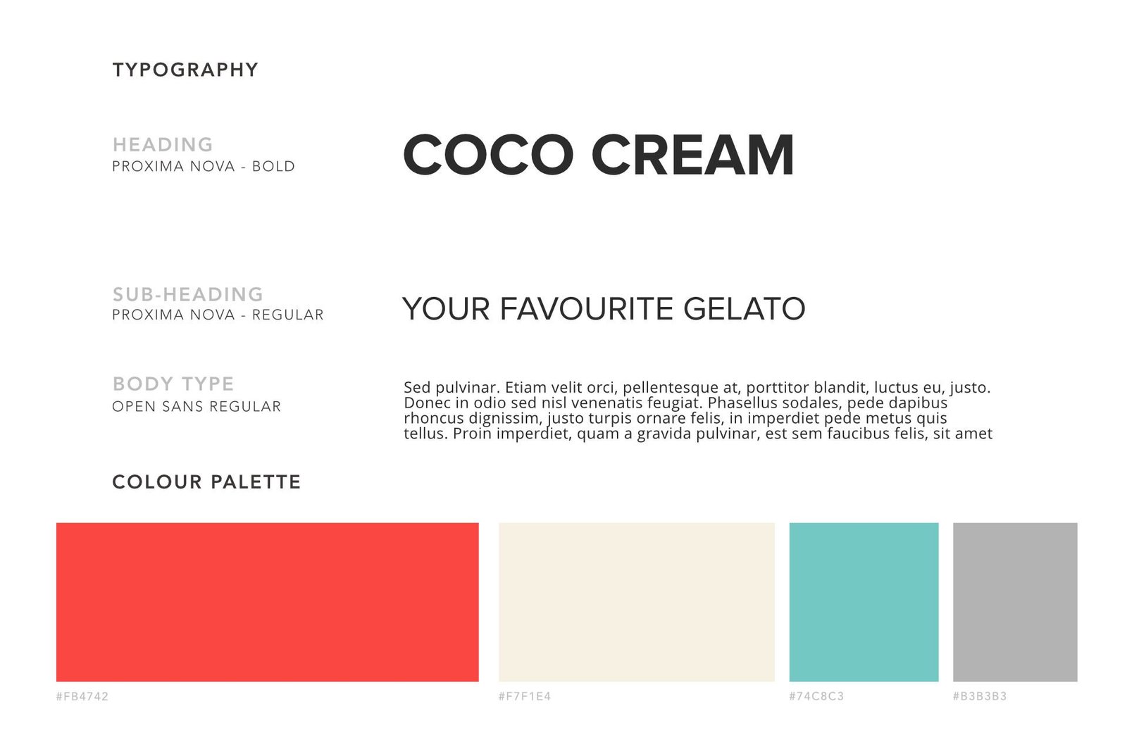
The client wanted a complete rebrand and the key words which the client wanted me to focus on was minimal, modern and fun. I went for a colour palette which was fairly neutral and something which would compliment the type of ice cream that they offer. After researching the Ice Cream industry I felt a simple icon would really help modernise this business. I opted for a professional and minimal style, which focused on a single icon. I infused the letter C within the ice cream scoops.
They approached me to help them update their branding, focus on their digital presence and provide a distinct and recognisable brand that would resonate through everything they do. They also required a clean and user friendly website which will provide a platform to market their business and to provide others with a potential opportunity to franchise the business.
Digital Development
After creating the brand and and identity it’s identity and ensuring consistency across all Business stationary. The next stage was to develop the website for Coco Creams.
Following the initial key words in our brand brain storm (minimal, modern and fun) I followed this through in the website development.
Making sure the website was user friendly easy to use and stuck to the companies brand guide lines.
The Brand
When creating a brand for Coco Cream I wanted to ensure that everything was consistent with their brand ethos.
I ensured every minute detail of the brand stationary was according to their brand guidelines which I created. This attention to detail was carried over to the packaging as well as any digital assets. This was to ensure a clear brand identity and to differentiate the brand from other similar products but still make it recognisable within the ice cream industry.
The typeface was Proxima Nova which with Opens Sans.
ServicesArt Direction, DesignYear2019Linkwww.yourlink.com