The Bread Co
Brief and Branding
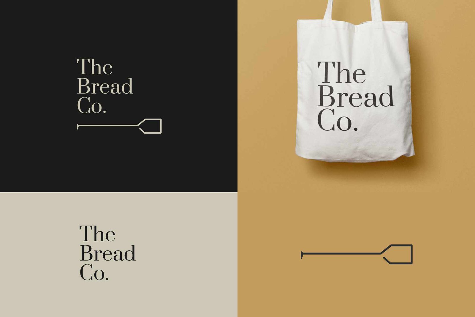
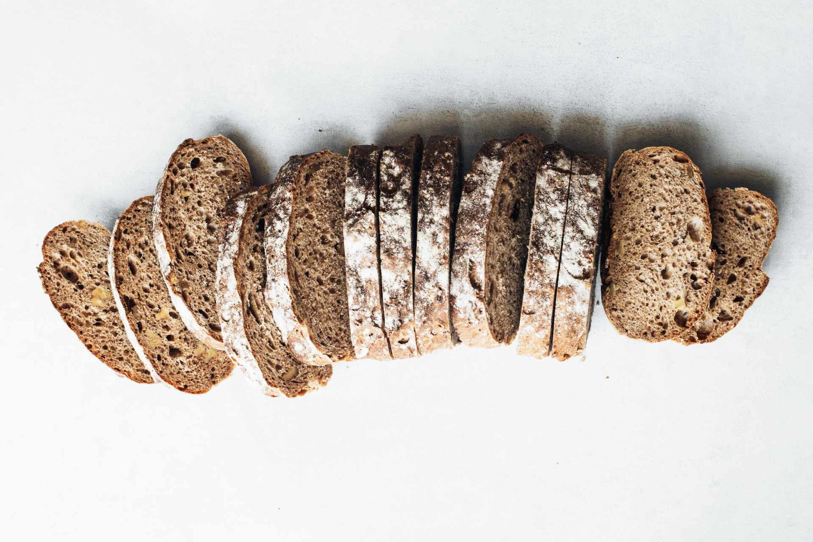
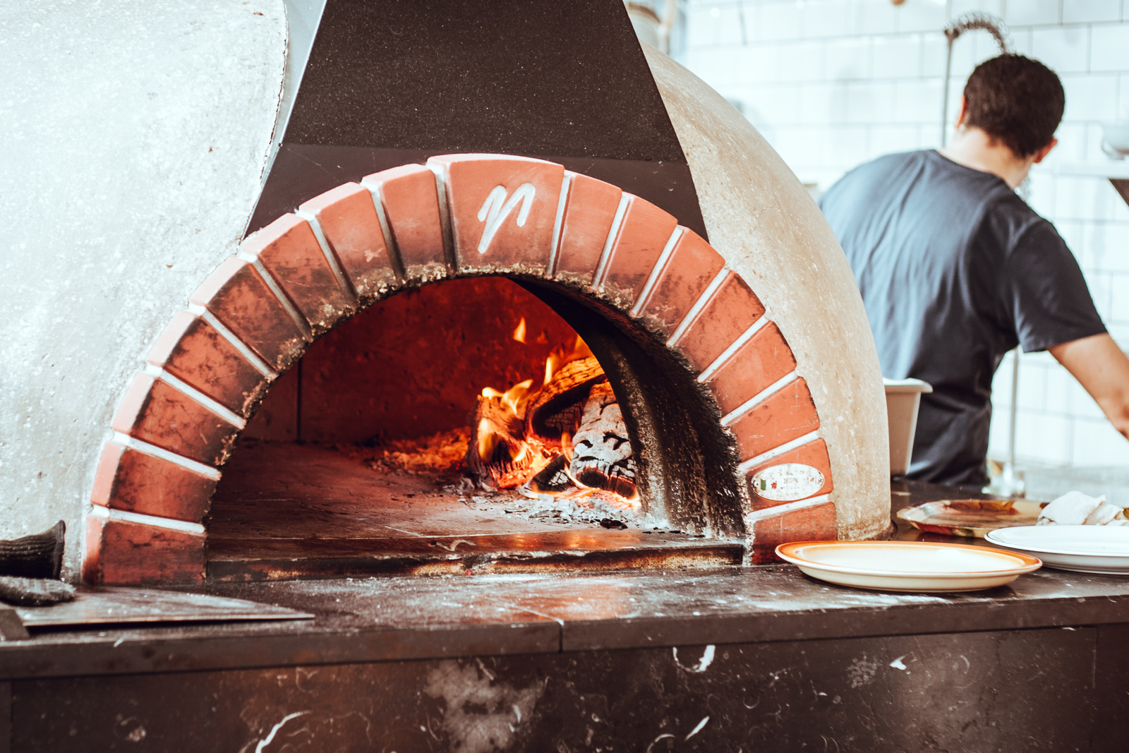
The clients brief was to create a logo and branding package which included business cards, gift cards, company stationary and packaging design for the product. The Bread Co wanted something very simple, elegant and emphasised a premium service the use of their specific technique of making the bread. As an upcoming Bakery, who specialise in a clay oven and ensuring their bread not only taste better but is a healthier alternative, they approached designbymys to help them update their branding and provide a distinct and recognisable brand that would resonate through everything they do. The logo was focused on the clients premier artisan bread and the icon emphasis the way the bread is cooked via a clay oven. Using these two elements as a key indicator for their branding.
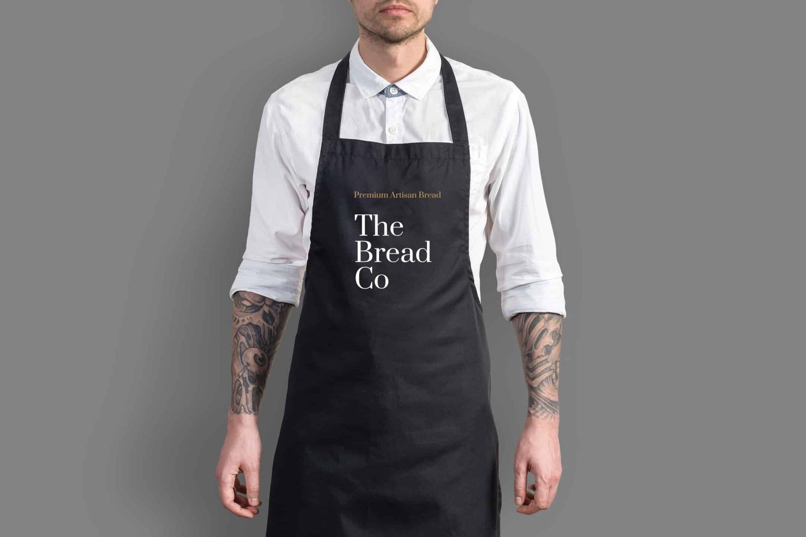
Packaging and Advertising
We worked closely with the client to help define a unique position. Our team came up with a strategy on how to ensure that the logo and the advertise campaign were in sync. We started focusing on the colour of the packaging and emulating the premium look and feel.
With the advertising the client wanted the product to be the main focus. Opting for a minimalistic approach to marketing.
Experience-design
Our focus was to ensure an end-to-end cohesive experience. We devised a strict guideline document and ensured all provided a premium feel. The designbymys team advised and designed every minute detail of the products and this attention to detail was carried over to the store as well.
The typeface I went for is Prata the reason for going for this font was to emphasis the minimalistic and rustic feel to the brand. The colours compliment this look and instead of opting for the cliche black and gold I went for pastel colours to modernise the look.
ServicesArt Direction, DesignYear2019Linkwww.yourlink.com