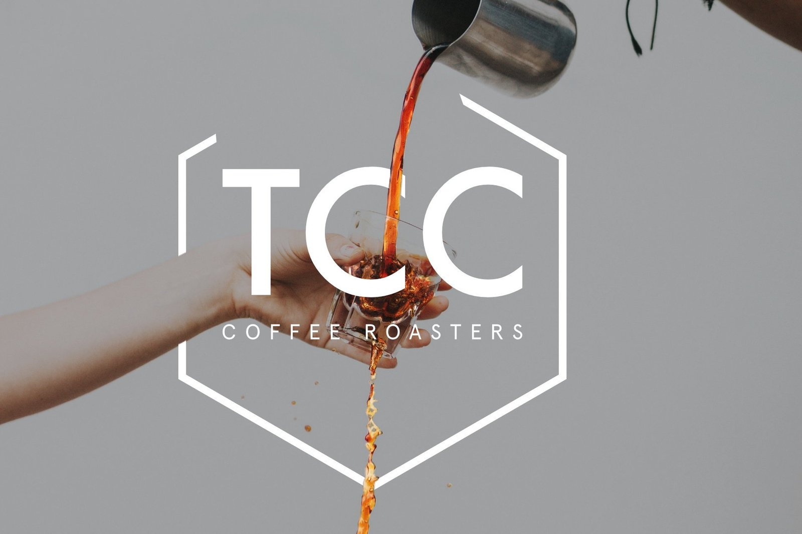
TCC
Brief & Branding
The clients brief was they wanted their brand to be consistent across all their platforms. We opted for bright colours as the primary colours and softer colours for the secondary colour pallete. Likewise they wanted an icon which represented their brand hence merging the letter B and a pregnant women.
They wanted this playful, aspect to also be represented on to their website. Their primary item for sale is baby teethers and within the USA and UK they have over 1,000 trusted reviews. They approached designbymys to help them update their branding and provide a distinct and recognisable brand that would resonate through everything they do.We opted to alter the type face as well and change the dots of the i’s to diamonds to have that theme across the icon and the typeface.
Packaging Design
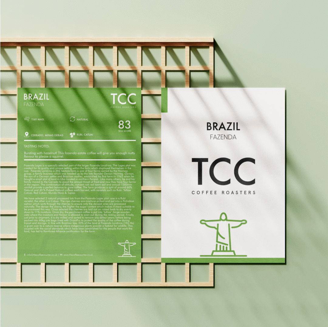
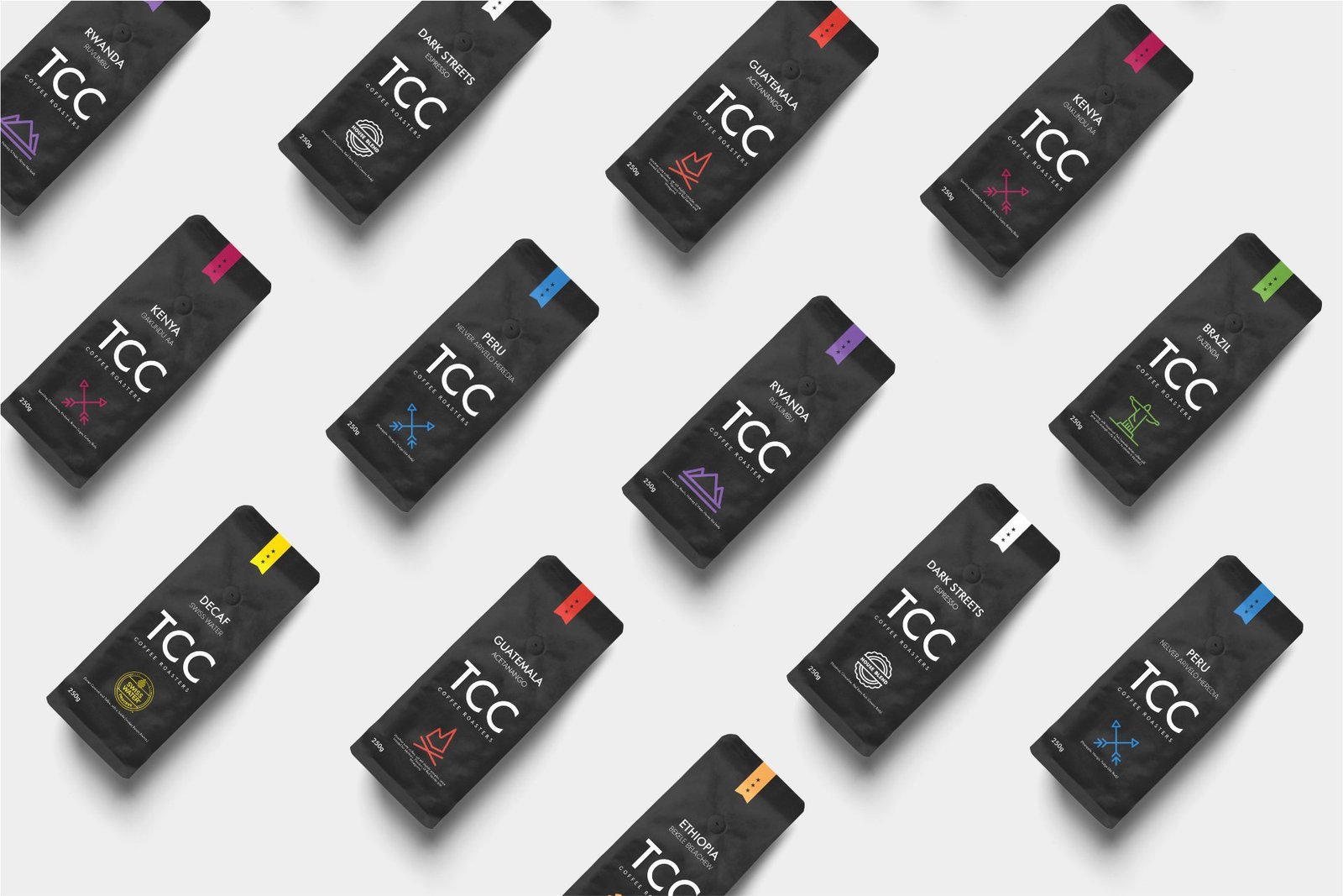
We worked closely with the client to help define a unique position. Our team came up with a strategy on how to ensure that the logo and the advertise campaigns were in sync. We started focusing on the colour of the packaging and emulating the premium look and feel.
Our focus was to ensure an end-to-end cohesive experience. We devised a strict guideline document and ensured all corporate branding followed the colour palette originally agreed on the mood board.
The designbymys team advised and designed every minute detail of the products and this attention to detail was carried over to the packaging as well as the company stationary. This was to ensure a clear brand identity and to differentiate the brand from other similar products but still make it recognisable within the dentist industry.
The typeface was Gill Sans however I customised the letters such as the top of the ”i”.
ServicesArt Direction, DesignYear2019Linkwww.yourlink.com