Burgrill
Brief and Branding
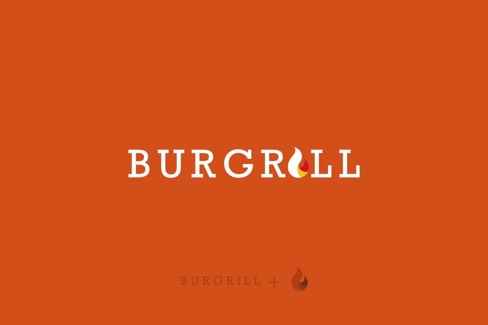
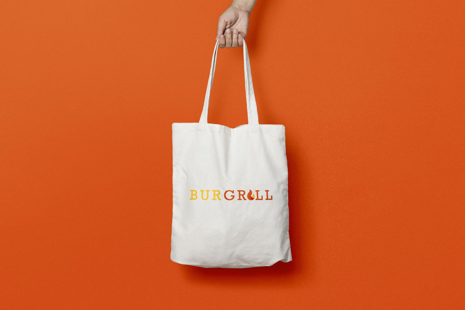
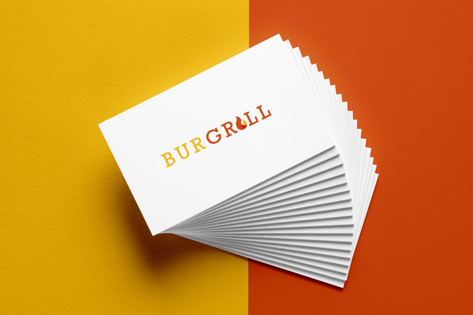
The clients brief was to create a logo and branding package which included business cards, gift cards, company stationary and packaging design for the product. Burgrill wanted something bright vibrant and catches your attention hence my usage of a Slab Serif Font. As an upcoming franchise, who specialise in a gourmet burgers and fries they approached designbymys to help them update their branding and provide a distinct and recognisable brand that would resonate through everything they do. The logo was focused around the aspect that the burger is made on a charcoal hence the use of the fire icon integrated within the grill lettering.
Packaging and Advertising
With the packaging we wanted to emphasize the icon and the type font used. Our team came up with a strategy on how to ensure that the logo and Burgrill’s advertising campaigns were in sync. We started focusing on the colour of the packaging and emulating that colour palette across the board.
With the advertising the client wanted the product to be the main focus. Opting for the burger to be the centre stage and to emphasise the ingredients over anything else.
Experience-design
Our focus was to ensure that the brand can easily be franchised hence an uniform look and feel and cohesive experience was vital. We devised a strict guideline document and ensured all corporate branding such as business cards and packaging was in sync. The designbymys team advised and designed every minute detail of the products and this attention to detail was carried over.
The typeface I went for is Rockwell which is a Slab Serif Font the reason for going for this font was to emphasis the rustic feel of the burger and the brand.
ServicesArt Direction, DesignYear2019Linkwww.yourlink.com